All case studies05 / 07
Branding & UI/UX · 2025
Quilligent Brand Identity
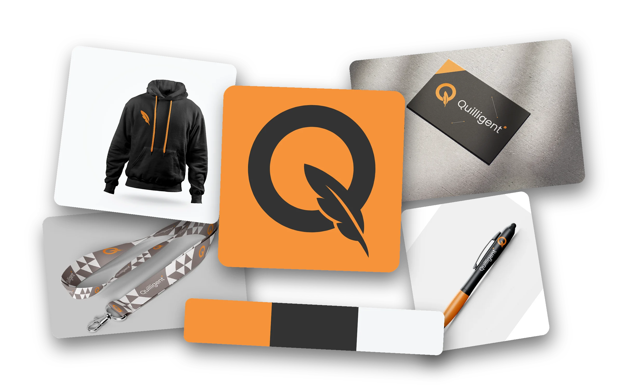
The identity behind Quilligent itself: a Q whose tail becomes a quill, a warm orange and carbon palette and a clean geometric type system, built to feel as precise as technology and as expressive as a story.
- Client
- Quilligent (in-house)
- Sector
- Technology & digital services
- Services
- Logo design, Visual identity, Colour system, Typography, Brand guidelines, Merchandise & stationery
- Launched
- October 2025
Art direction
Precise like technology, expressive like a story.
Every choice pairs a rational element with an expressive one: a geometric circle with a hand-drawn quill, an energetic orange with a grounding carbon, a sturdy sans with a lighter companion.
The palette reflects the brand's dual identity, the harmony between technology and creativity, logic and imagination.
Personality
- Strategic & Analytical
- Collaborative & Empowering
- Creative & Polished
- Innovative & Scalable
- 01
The brief
A new agency offering ERP, web and marketing under one roof needed an identity that could speak to technical buyers and creative ones at the same time.It had to carry the company's core value, harmony between a business's internal operations and its market presence, and stay recognisable everywhere from a favicon to a hoodie. - 02
The concept
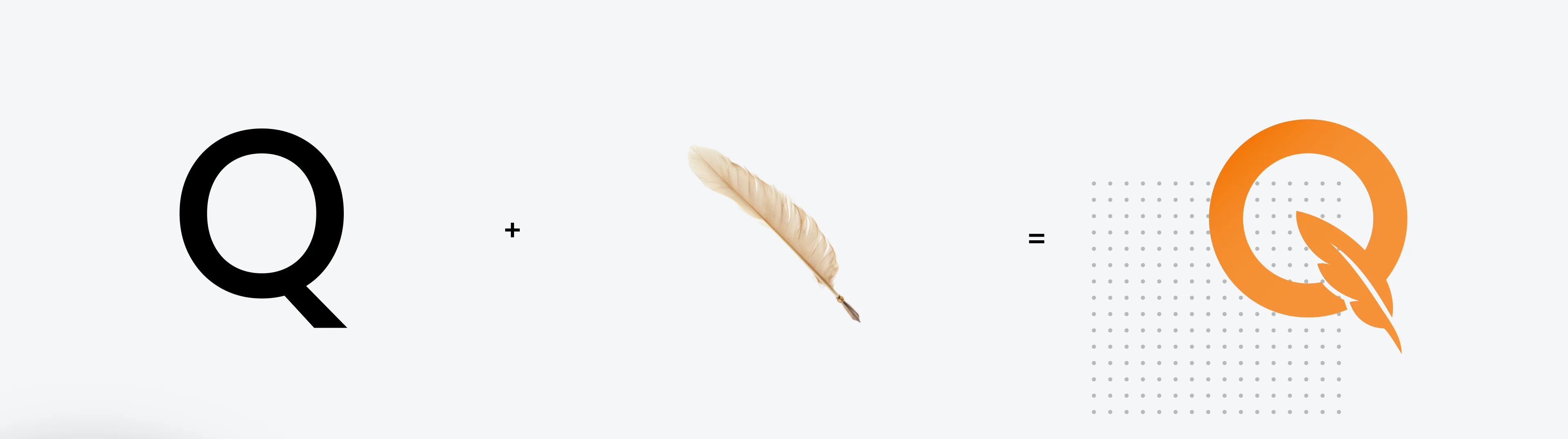
The mark is built around a stylised capital Q, for clarity, intelligence and precision. Instead of the letter's traditional tail, a quill pen cuts through it: a symbol of creativity, storytelling and communication, and of the company's expertise in both technology and marketing.The circular Q conveys unity and completeness while the quill adds a dynamic, human touch. Together they balance logic and creativity, the same balance Quilligent promises its clients.Colour and type follow the same idea: an energetic orange grounded by carbon, and a geometric primary typeface paired with a lighter companion. - 03
The outcome
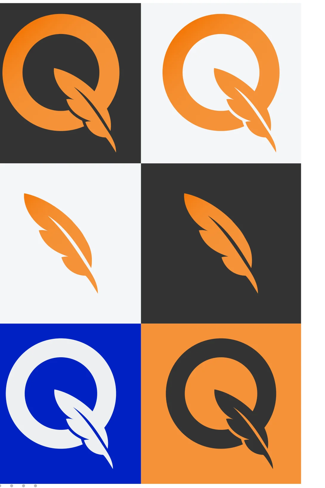
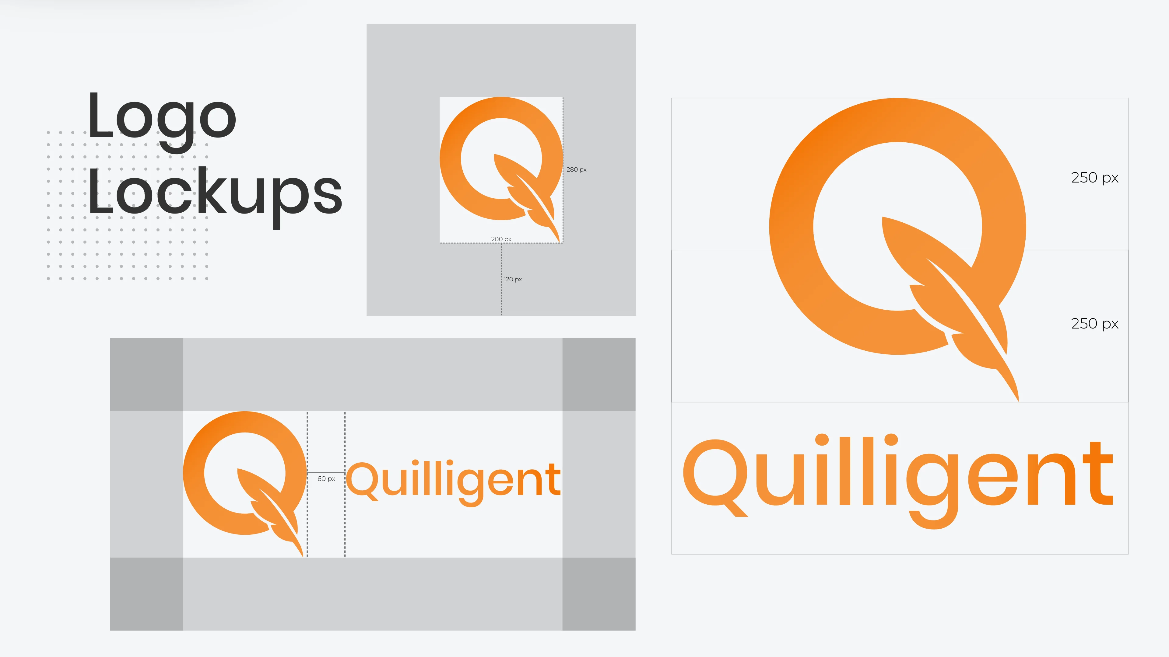
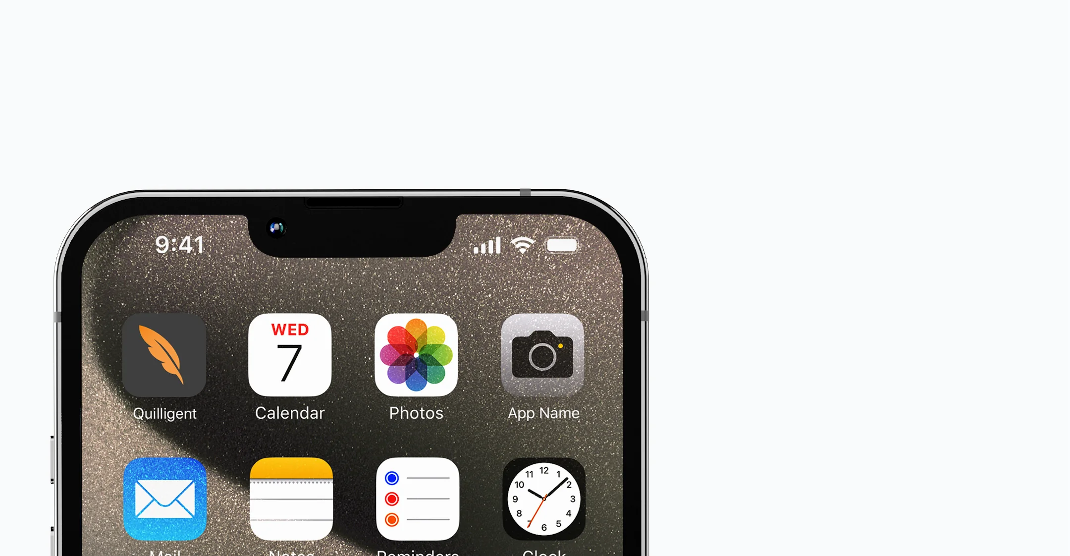
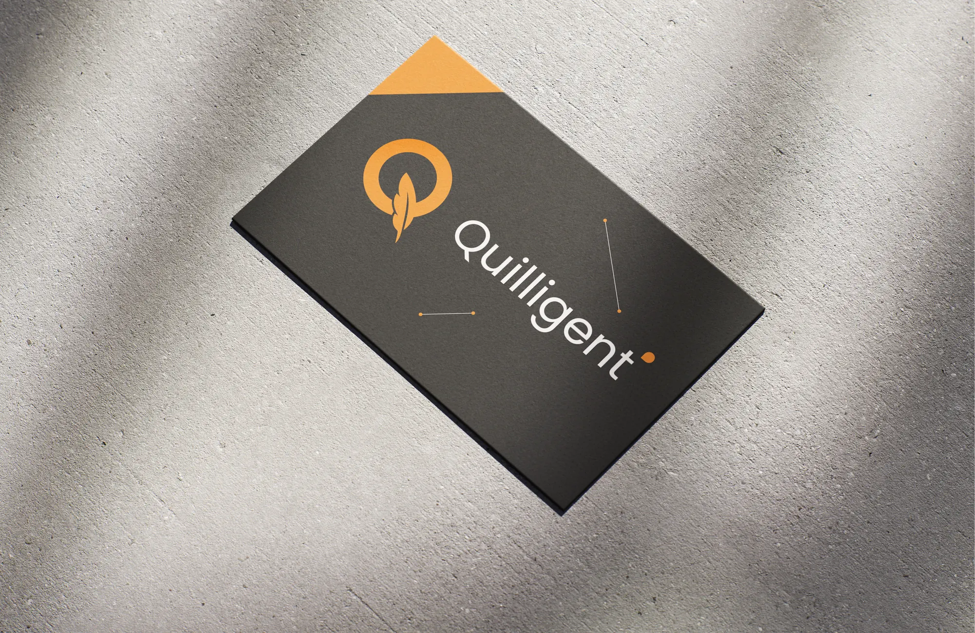
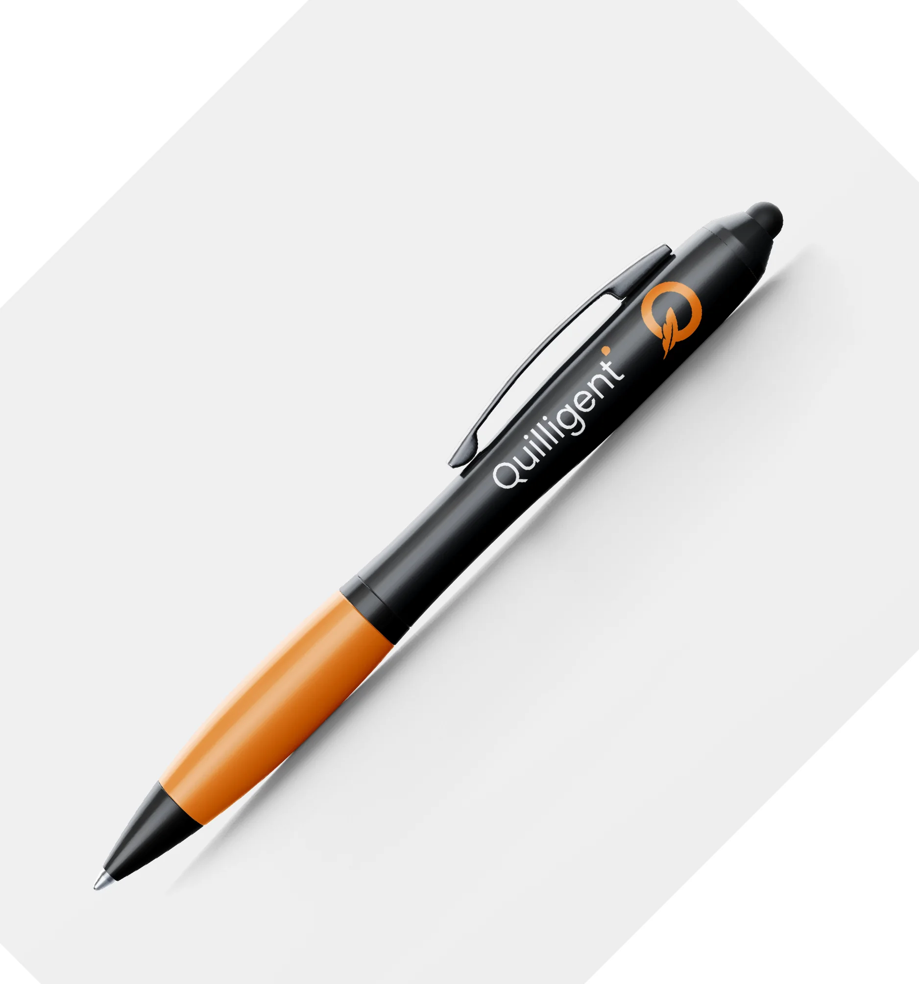
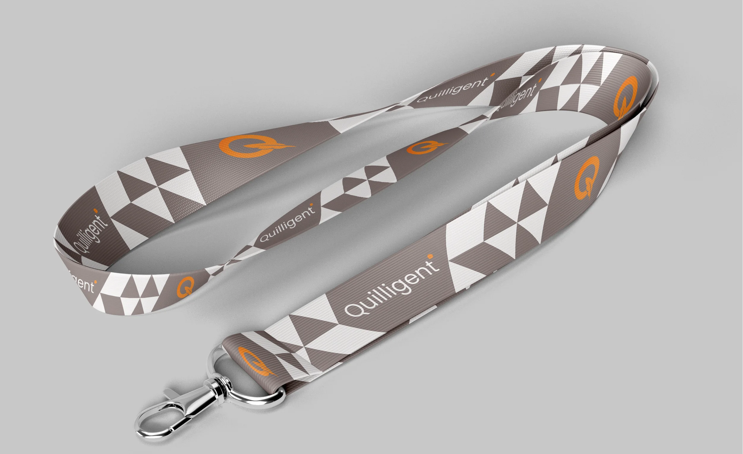
A complete 26-page guideline covering the primary and secondary logos, four colourways, lockups with clear-space rules, a primary and secondary palette with colour theory, and a two-typeface system.The identity now runs across the website, an app icon, merchandise and stationery.
The mark
5 views
The primary logo is the full Quilligent mark: a capital Q with a quill pen replacing its tail stroke, the seamless blend of technology and creativity.
The secondary logo is the quill on its own, a simplified mark for small spaces such as social icons, app favicons, watermarks and merchandise.
Colour
Each colour was selected to evoke a specific emotional response that aligns with the brand's core values: innovation, intelligence and expression.
Typography
01
Primary typeface
Poppins
ABCDEFGHIJKLMNOPQRSTUVWXYZabcdefghijklmnopqrstuvwxyz0123456789 !?@#&
Regular · Medium · SemiBold
02
Secondary typeface
Montserrat
ABCDEFGHIJKLMNOPQRSTUVWXYZabcdefghijklmnopqrstuvwxyz0123456789 !?@#&
Regular · Medium
Applications

Deliverables
2
Logos: the full Q and the quill
4
Logo colourways
4
Core brand colours
2
Typefaces: Poppins and Montserrat
7
Branded applications
26
Page brand guideline